Postcards, Floor Banners, Brochures, Cards & Assorted Marketing Assets
All designs were crafted to highlight important information, keep details concise and clear, and expand the effectiveness of their designs for the business and their clientele.


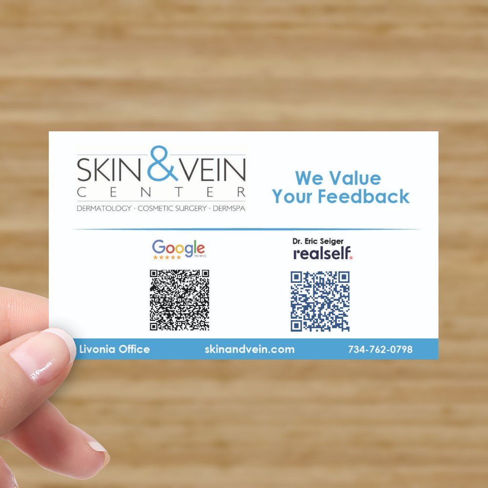
QR Review Card handed out to clients after medical visits
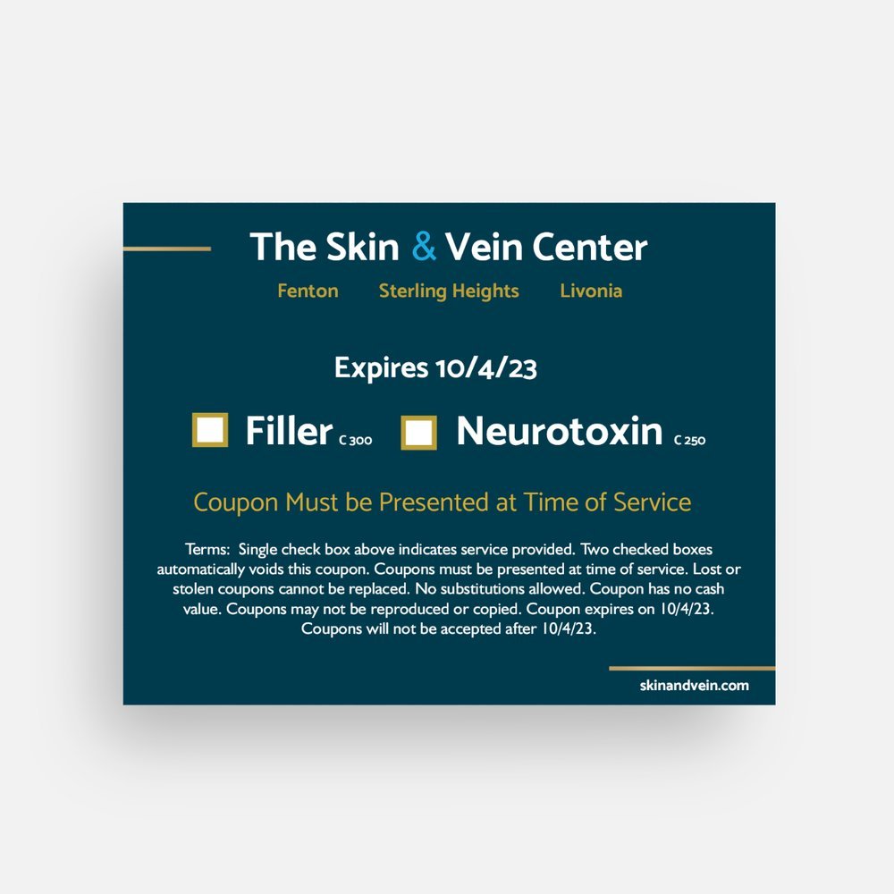
BOGO duplication secured coupon
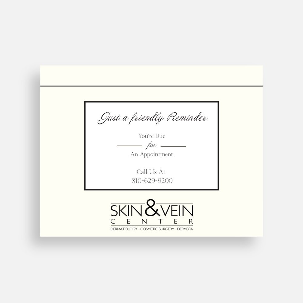
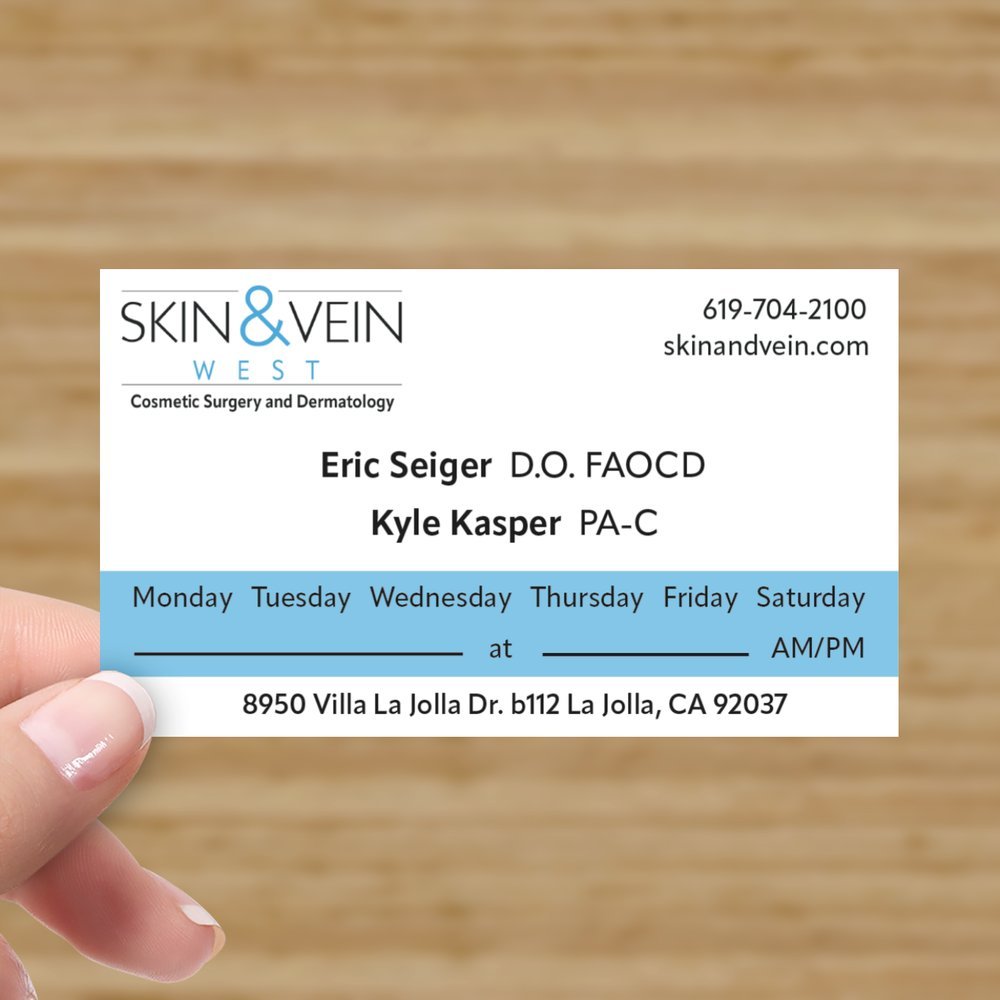
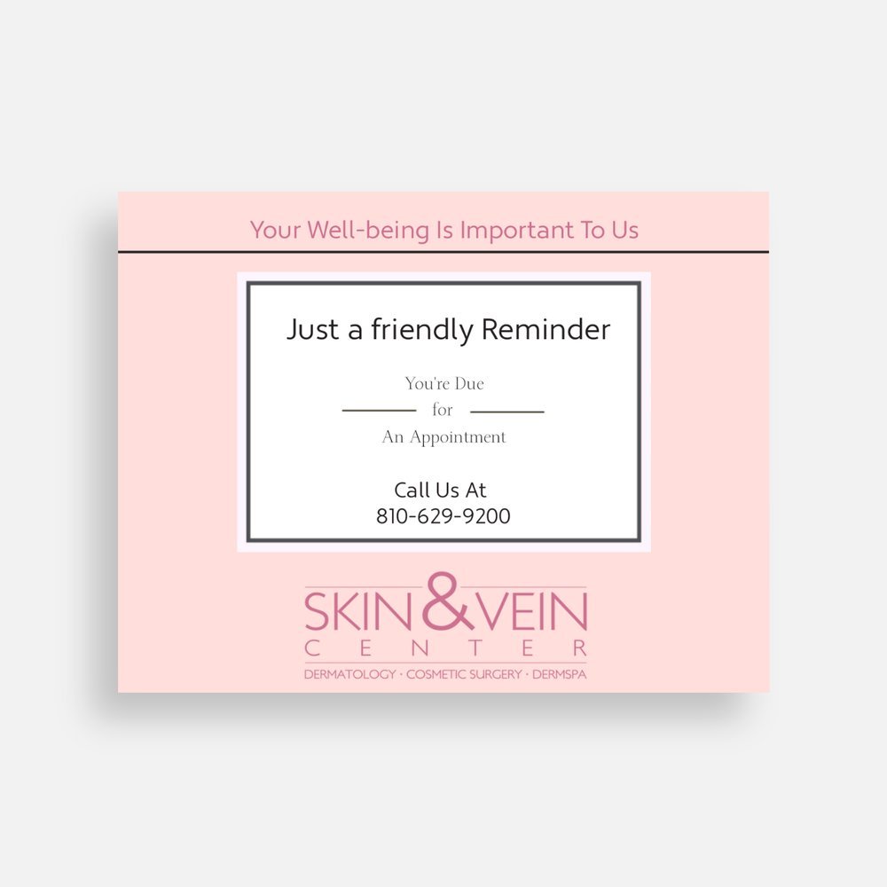
Appointment reminder mail card

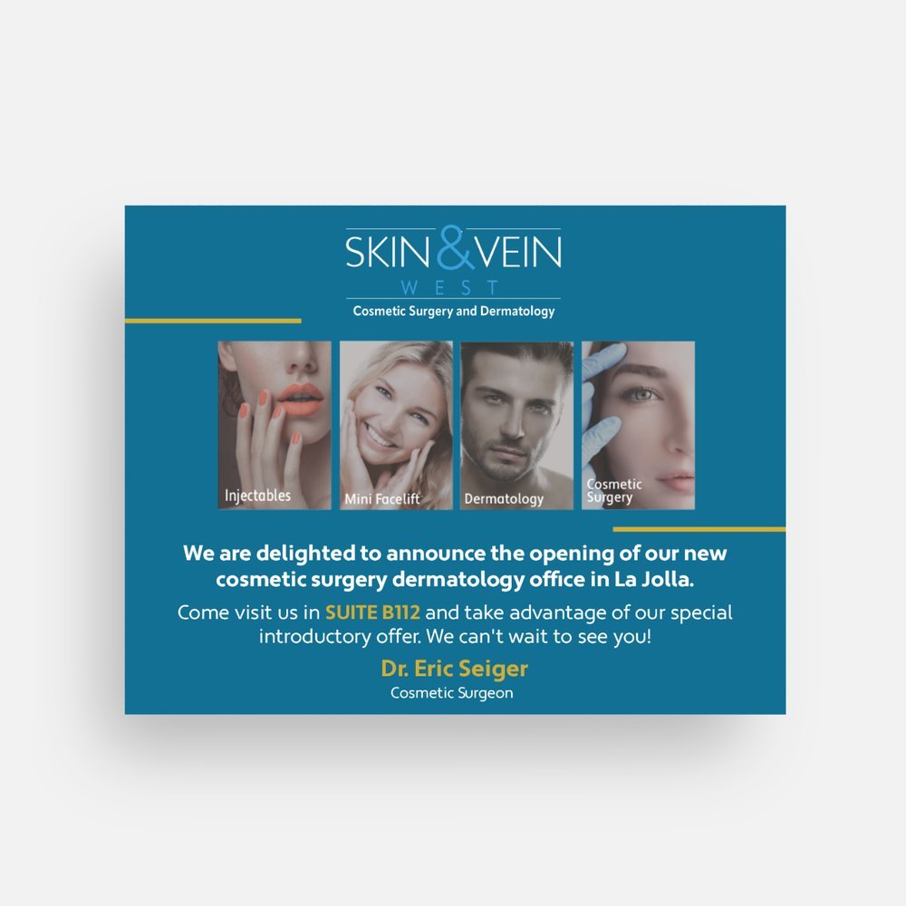
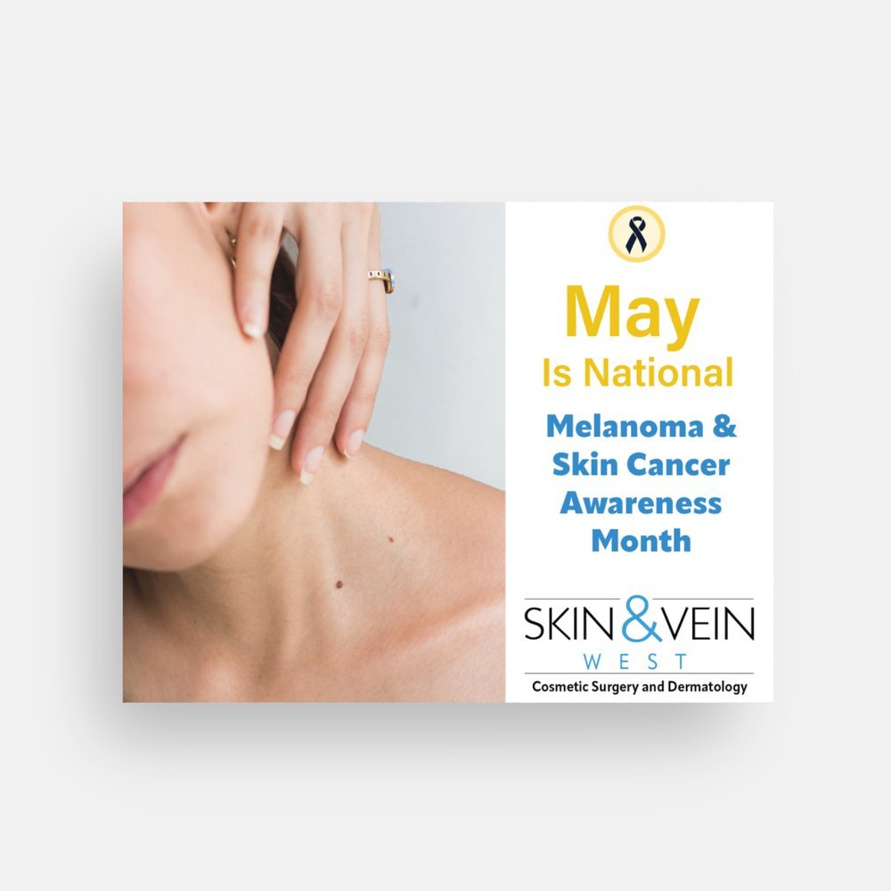
Front Side of Official Event Flyer

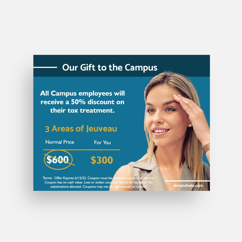
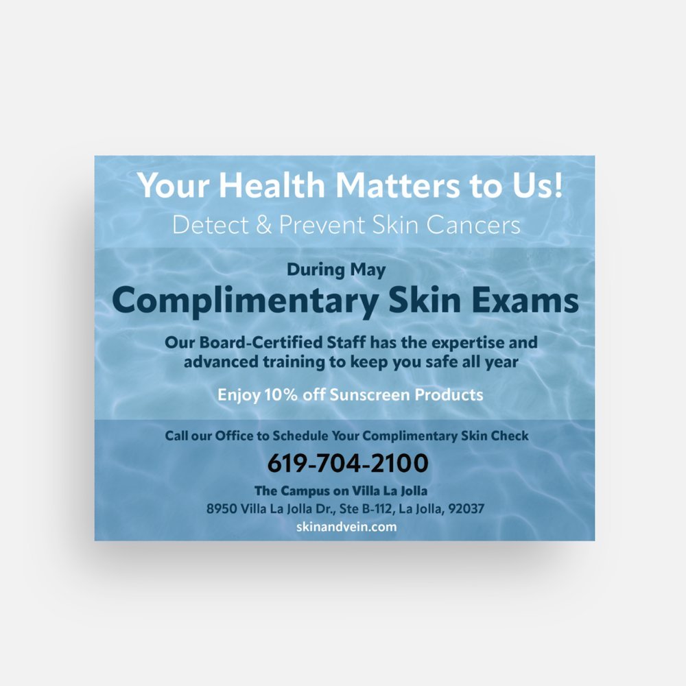
Back Side of Official Event Flyer

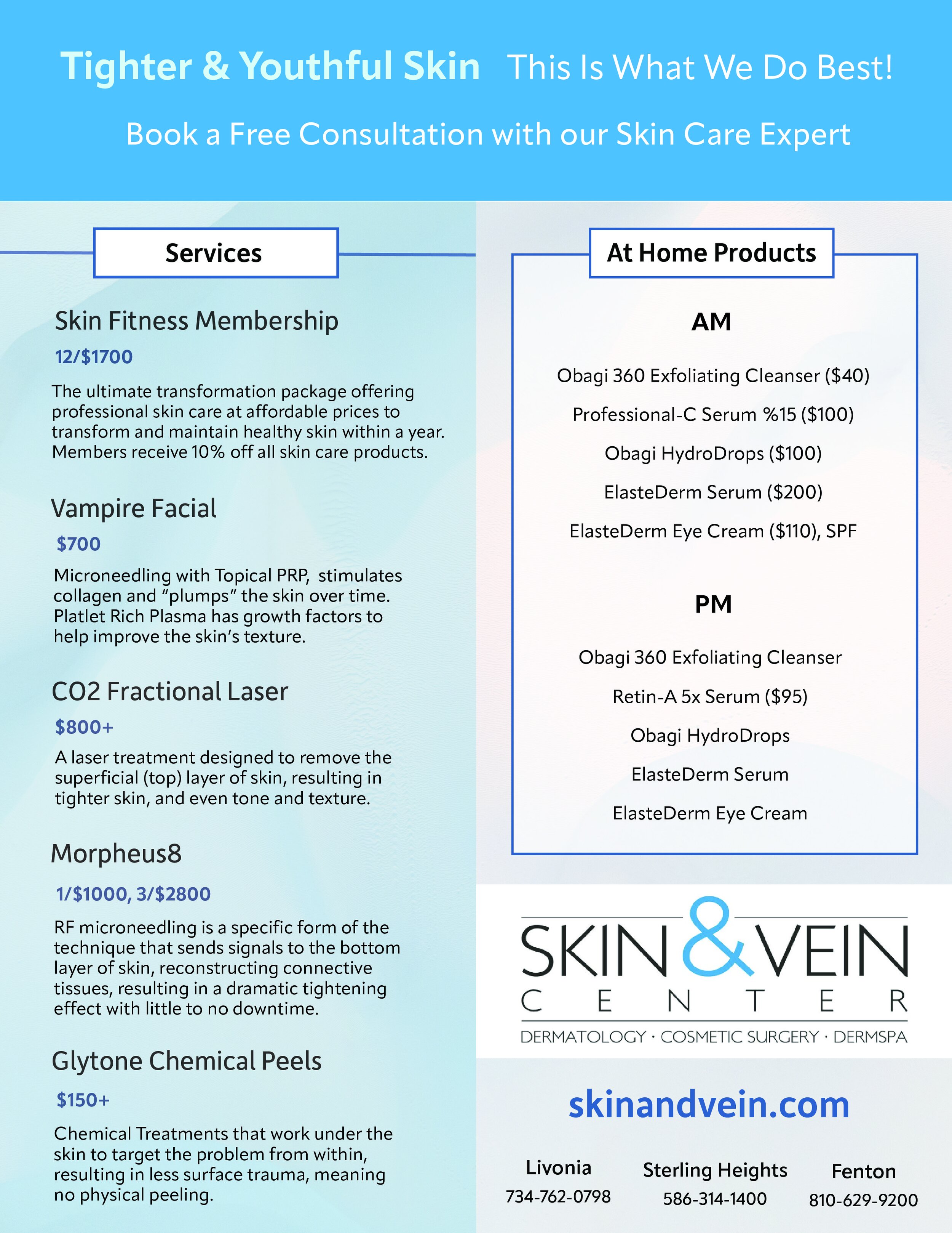
Updates and reiterations created for treatment brochure
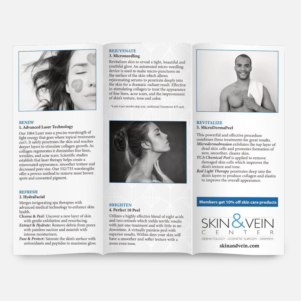
Updates and reiterations created for treatment brochure
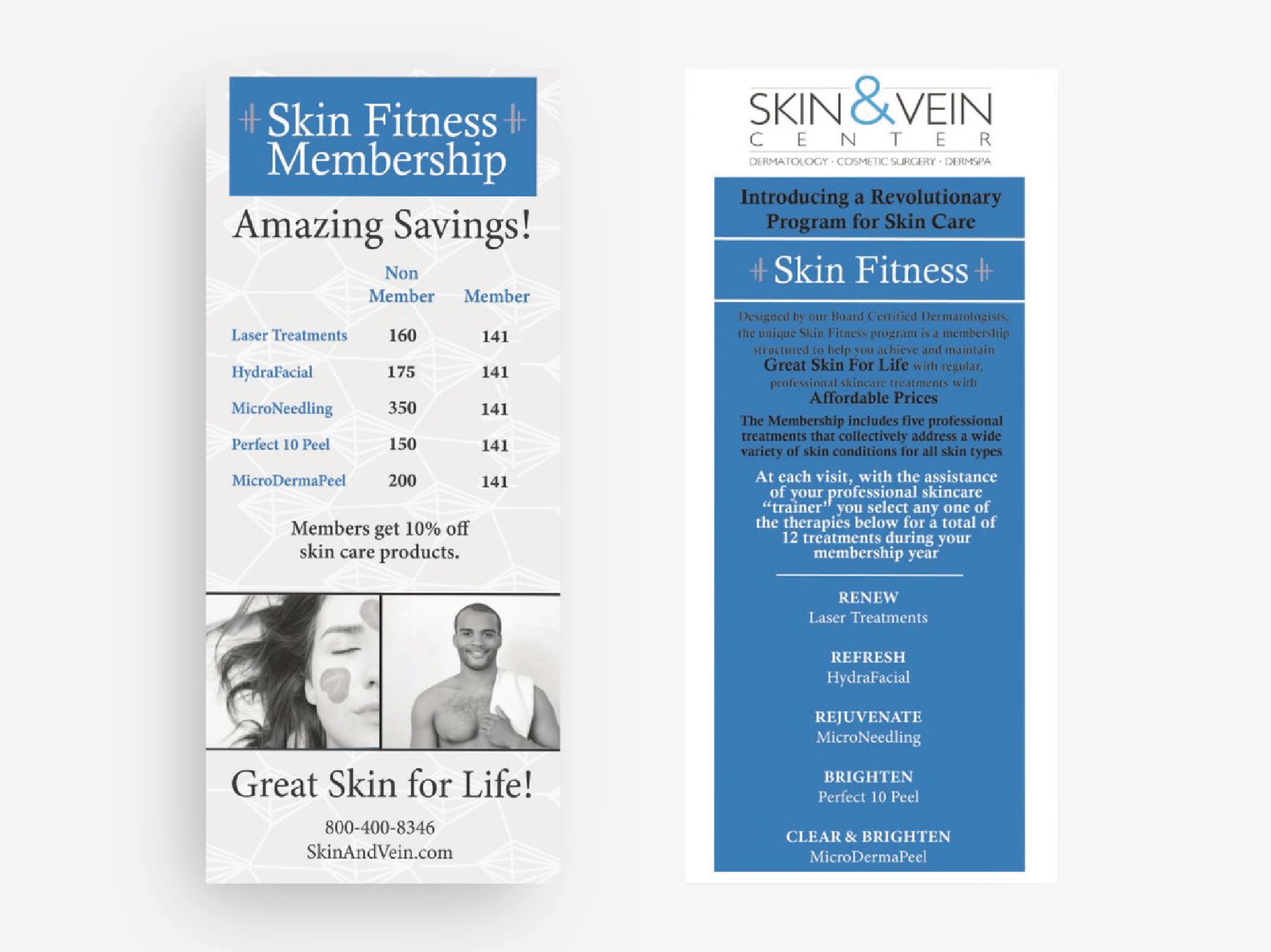
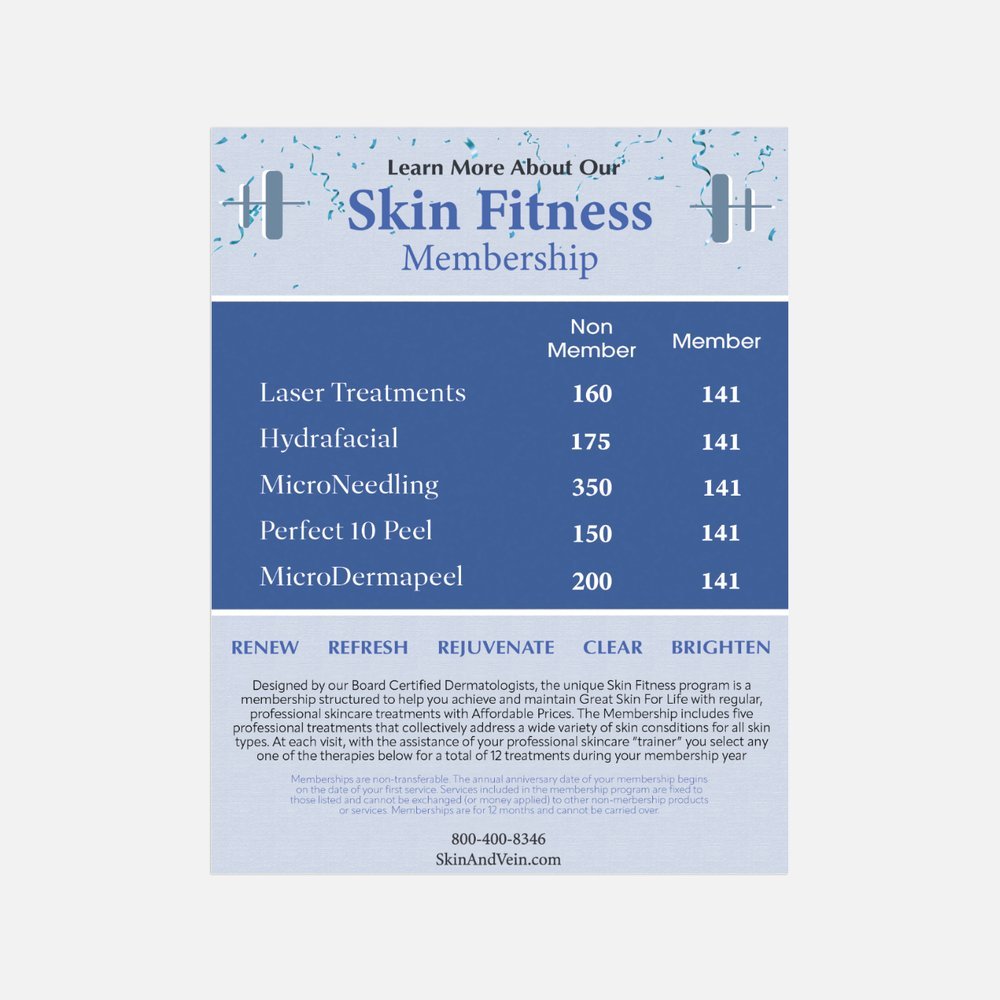
Original design of a medical service brochure

Original design of a medical service brochure


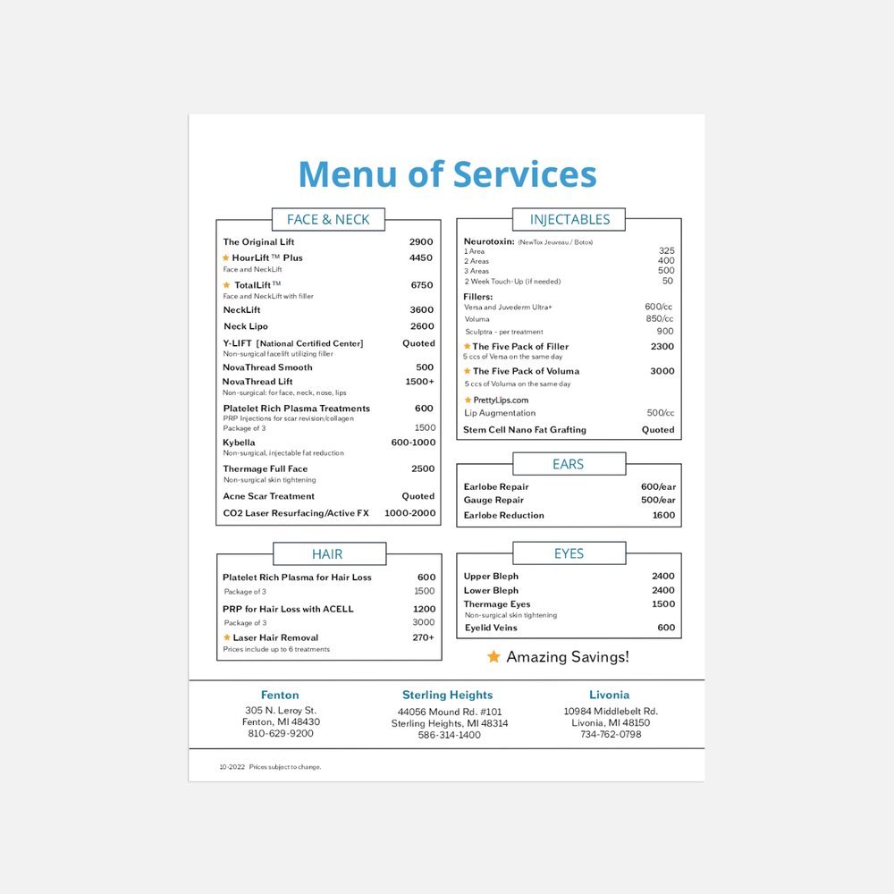
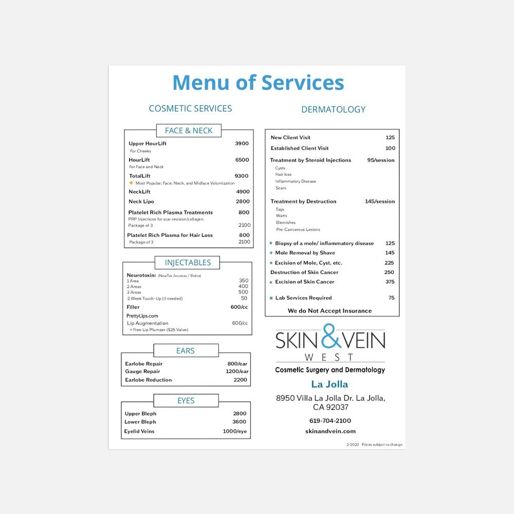
(Scroll) Menu of Services - Front Page
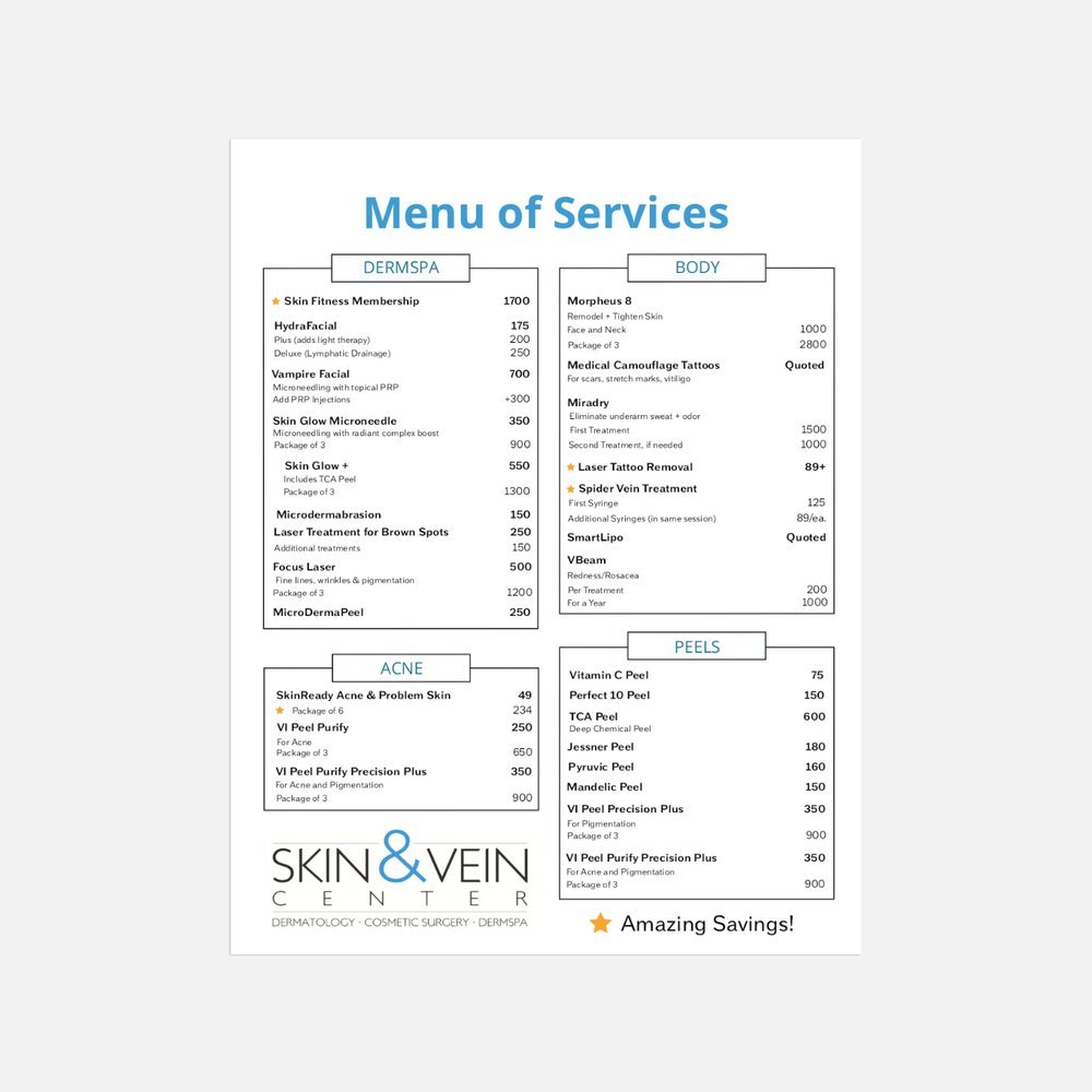
(Scroll) Menu of Services - Back Page
(Scroll) Menu of Services - California Office