The Skin & Vein Center West Logo Creation
Conversion of a company’s longstanding official logo to accommodate the opening of a new, California-based operation. The inclusion of the word “west” as well as some slight typographical changes created a new, refined look for The Skin and Vein Center.
Personal Branding


This project was created to demonstrate the process of instituting a personal branding presence. The goal was to fuse my personality & artistic style into an icon that also highlights the serious graphic design skills present in my career. The included graphical elements showcase my style in a clear & concise way.
Personal branding items like pins and tote bags were created to allow for support from peers, consumers, and companies. They were also mocked up to showcase how this logo would work in other mediums, and to demonstrate the finalized all-encompassing branding of this design work.


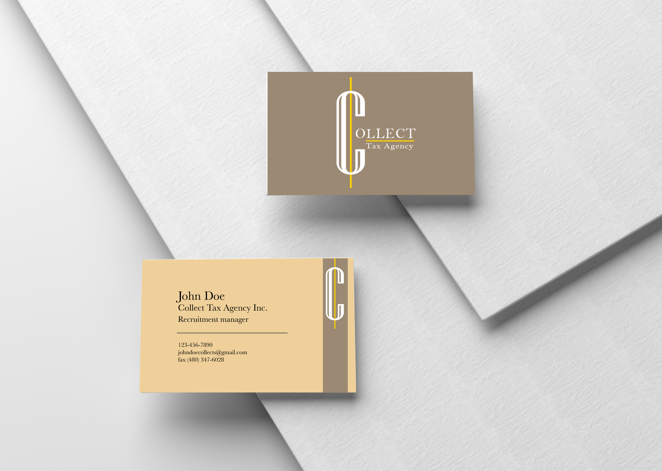
Branding Projects


These three brand development concepts were created in my junior year of college. These mock companies were crafted to conceptualize a business’s overall brand design, including: logo, merchandise, social media to visualize a successful company’s process entering & navigating the modern business environment.


The GreenBar Juicery is a freshly squeezed cafe that prioritizes healthy, affordable drinks that truly refresh their clients. This store wanted a brand identity that matched their product: simple, clean, and refreshing. This branding project was developed through careful inspection of the market, an analysis of the target audience’s demographic, and a focus on a minimal style and bright, fun colors. Road signage, packaging, and advertisements were created to showcase this new business for optimal promotion.
Helix was started to combat the athletic corporations that are currently dominating the industry. Keeping middle and lower class incomes in mind, Helix is an alternative athleisure brand that focuses its demographic on middle-aged audiences. Style is a big element of this company, but Helix prefers to remain simplistic in nature, with quality being the main focus. Muted blues and reds were incorporated so that adults could have colorful apparel without being flashy. Our designs were created to replicate the flexibility, perseverance, and durability within the incredible human body.


Collect is a local tax agency, operating one location owned by a family in the community. This business has a focus on serious, formal work, but doesn’t want to be known by clients in the same light. The design strategy worked to blend corporate professionalism with the collaborative elements at play. The branding was meant to be inviting, while still broadcasting the formal elements that allow this company to flourish. The color scheme was chosen to remain simple, calming, and professional.